Latest Blogs

2 most important things to know about Ganesh festival

In this season, there is no better subject than Lord Ganesha. Ganesh Chaturthi preparations are going on throughout the country. Many of you must have done all the preparations, so this can be your check list & for those of you in the process of doing so, can follow these quick & easy guidelines. This blog is a special subject related to interior decoration & I thought of giving it a few guidelines with respect to Vastu. There are 2 main things involved in the Ganesh festival. 1. Decoration There is no hard & fast rule on how to decorate. 
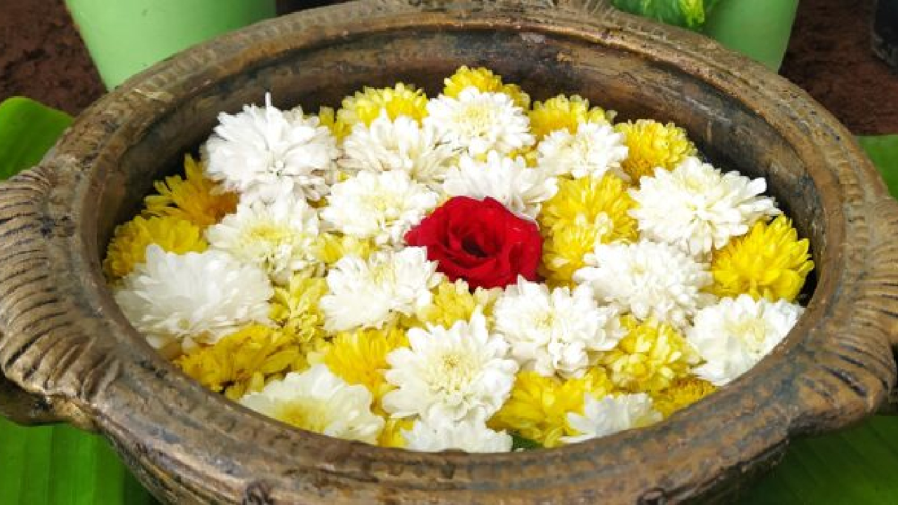
For decoration use easily available things at home which are also ecofriendly, to avoid pollution & extra garbage. eg; flowers, leaves, plants, cotton clothes etc Avoid synthetic, rubber, plastic materials. Backdrop Backdrop makes the entire puja stand out. While choosing materials try to use natural materials as mentioned above. Avoid too many colors. Choose 2 or maximum three colors from white, orange, yellow, green, gold, silver etc. Choosing dark colors will affect your mood & vibrations, so be aware about it. Remember idol should be the highlight & not the backdrop. You can make the backdrop simple & ecofriendly by keeping plants around the table as shown in the picture. Lighting Let natural light be a part of decoration. Don’t overdo artificial lighting, keep it balanced. Give an overall mild lighting. Never focus light on the idol’s face. You can make a combination of ambient lighting & accent lighting for better results. 2. Idol selection This is the most important thing to consider. Go for clay idol for obvious environmental reasons. 
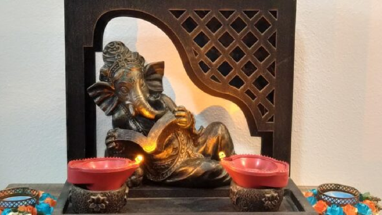
A seated Ganesha brings in peace, happiness & love (spiritual growth) whereas a reclined one brings in luxury, comfort & richness (materialistic growth). Pay special attention to the trunk. Trunk to the left symbolizes prosperity & happiness. Lord Ganesha with trunk to the right is believed to be difficult to pacify & hence one need to follow all the rituals correctly. Idol Color White idol symbolizes harmony, peace & happiness. Alternatively, a saffron colored idol can also be chosen for self growth & success. Never face the idol to the south as it can do more harm than good, according to Vastu. Never keep an idol in the bedroom, store room or under the staircase. These are few of the basic things when one follows, makes the festival full of joy, happiness, prosperity and of utmost tranquility. Wish you all a happy Vinayak Chaturthi !!

5 most important things to know about Industrial Interior

Tired of seeing same ceiling everywhere made up of plaster of paris, gypsum board or plain ceiling? Then why don’t you try something different which is simple, low budget & trendy. I am talking about an industrial interior which is in growing trend. It is opposite to what is normally done. Instead of hiding the unpleasant things they are exposed proudly & kept them in raw form as it as. To know more about it read further. Following are a few guidelines which need to be followed while opting for industrial look. The key thing to remember in industrial interior is to keep the space open & minimalist as much as possible. Architectural elements Keep the structural elements as they are. For example metal doors, windows, AC ducts & pipes. No need to worry about false ceiling as pipes & ducts are the main heroes in this. AC ducts & electrical pipes are the things which are normally hidden in the false ceiling for aesthetics. Same things get enhanced in industrial ceiling as you can see in the pic. Color This is the most simplest yet critical task in industrial interior. Black color should be in use as metal will be prominent in the space. It should not be more but need to be balanced with other colors. Whether it’s a wall, furniture or accessories don’t choose too many colors but go for neutral color scheme. Combine them with golden, bronze or copper tinge to give a rich look. Light Light is another important element in industrial interior. You can use led lights to highlight things or industrial lights for ambient & task lighting. While choosing light again make sure there is metal element in it. Then those could be used either as chandelier, single pieces or in cluster. Pendant light or floor light can be used depending on the requirement of the space. If you have glass partition wall, then neon lights can be used to write some personal message on it to give some dramatic effect. Furniture & Accessories While choosing furniture strictly avoid bulky sofa, chair or any such furniture. Choose furniture for function & not to occupy the space. Let it be minimal & simple, to solve the purpose. While choosing accessories be careful with the color. Black, white & grey combination art pieces, paintings or accessories adds beauty to this type of interior. So do try hands on some art piece.  Material While selecting materials keep in mind these few things. Walls can be of Matte finished or exposed bricks. Flooring can be of finished concrete, kota, wooden etc. For kitchen, platform could be of concrete or stone finish. If using as pantry it could be of wood or metal as well. These are few of the important points one need to consider for industrial interior. Industrial look has been popular in malls, restaurants, pubs, workplaces. Now this is creating place in homes as well. If one is thinking of new & different look then this is the best option in my opinion, do try.  

3 Ultimate things to know about home/office color decoration

Continuing with the series focused on decoration. We have discussed enough about color. One of my friend said “It is quite confusing so give me easy ways to choose color while decorating my home.” So let us see how to make it simple. While choosing color for your home/office you need to have one of these goals. 1. Soothing and relaxing : Monochromatic color scheme creates simplicity, unity & soothing effect. This is based on how the brain tries to make sense of new spaces. The less the brain has to understand, the more quickly it absorbs everything. This promotes a more peaceful mindset. Mono is single, chroma is color.  When shades & tints of single color are used , a monochromatic color scheme is formed as shown in the picture. Start with the color of your choice & then with the help of shades, tones & tints give the illusion of space. Shades : In shades, the base color is darkened by adding black to it. Tones : Here the base color is made dull (desaturated) by adding grey to it, and Tints : Tints are the base colors which are lightened by adding white to it. Monochromatic color scheme is the easiest to use and hardest to mess up. Tip: To avoid monotony use textures & prints in accessories & light. 2. Elegance : Neutral colors create an elegant, rich look & give flexibility to the room.  Neutral color includes black, white, brown, grey & beige. Great advantage with neutral colors is that they don’t have much effect on moods. We can add furnishings, accessories & art pieces to create a particular type of mood.  White, off white, light grey to light medium beige shaded are great for people who enjoy the feeling of clean, bright and open space. White color creates the feeling of elegance & larger space & so it can be used for small rooms. You can use black or brown color as an accent wall to give the stylish look to the room. When used sparingly black & brown gives the feeling of richness, confidence and being in control. 3. Warm or Cozy When you want to make a small room look bigger, use lighter shades of cool colors such as blues, greens, purples & anything in between which recede visually & make the walls feel away from each other. Suitable for smaller rooms. Refer the picture. If you want to make a big room feel cozy and intimate, use warm colors; such as shades of red, orange, yellow or anything in between that make the walls look closer. This is ideal for bigger rooms.  Hope this article will make the task easy in picking color of your choice. Quiz time What is the mood created in the following pic? Choose one of the options below : Elegant? Vibrant? Soothing?

3 simple things to know about cool and warm colors

Often people mistake design with decoration but both are completely different topics. Design is making the available space functional and appealing as per clients need and requirement. Whereas decoration is an act or object intended to increase the aesthetics of a room. I am starting a new series called decoration. Decoration may look like simply placing some artifacts and furniture but there is more than that. Decoration has many different layers which need to be taken care one by one. The first layer of decoration is color. Color is a vast topic, it consists of color types, color schemes, meaning of various colors & also advanced color theory. In this blog I will tell you about color types. Let’s start with simple things called cool & warm color? Cool Color The name itself tells that it gives cooling effect to the eyes. Cool colors are used in a room where sunlight is more Cool colors can be used in south & west side rooms It consists of colors like blue, green, purple and anything in between These are called cool colors because they remind us of earth, water & trees which represent nature. They create serene calmness effect in a room. In this pic you can see green walls & plants which represent cool color. Only cool colors may create dull atmosphere so to create rhythm & unity, need to add some tinge of warm or neutral color. Here, neutral colors like grey, black & white are used in accessories along with brown sofa. Warm color Warm colors are used when there is a small window or no window in a room Warm colors can also be in north or east rooms Colors like yellow, orange, red to pink give warm feeling Shades of these colors need to be chosen in such a way that they feel warm & not scorchy. In the above pic, the room does not have window & so it was feeling dull. To remove dullness of the room, walls have been painted with warm colors & to break the monotony, a big grey chair is added. Similarly accessories, paintings & plants of cool colors can be used to bring harmony & balance in the space. Keeping these colors in mind you can play with their shades & tints to get the desired effect. You can check more about color, in how to choose paint for your room. To know in detail about cool & warm color & more about decoration I have developed a course called “All about interior decoration“. Click here for more information. Quiz time Which color type is used in the above pic? Also can you tell which color principle gets applied in this? Click here for hint. Write your answer in the comment box below. Coming up next more interesting things about decoration.

All you need to know about an ergonomic kitchen

Continuing with the series focused on health & wellness called, Ergonomics. In the previous series you read about – It is dangerous if you neglect this One thing How to have proper posture while reading, writing & watching Best practices to increase work efficiency Whether to push or pull a load & now the most important part in a house, the kitchen. A kitchen is a cooking place, store room, dining room, family room, working place & thus an important place in the house. The kitchen is said to be the heart of the house. But do you feel exhausted after working in the kitchen? It could be either you are moving a lot or standing still. There are guidelines to minimize the stress in a kitchen & enjoy cooking. In general, kitchen counter top height is between 28 to 34 inches. If necessary, customize it as per your height. Kitchen is divided into 3 areas & are collectively called as “kitchen work triangle” in architectural terms. Let us see them in detail & their relation with each other. 1. Storage Cook top includes stove/cooking range, microwave, oven, etc. It also includes preparation area which in turn includes chopping, kneading, grinding, etc This area needs to be clutter free as it requires more platform space. Points to remember: Towels, dish soap, and sponges should be near the sink. Oils, spices, pots, pans, and cooking utensils should be within reach of the stove. Knives, peelers, and cutting boards should be near the food preparation counter. In kitchen work triangle, when an imaginary line is drawn connecting three of them it should form a triangle as shown in the pic. The distance between refrigerator (storage), sink (washing) & stove (cooking) should be between 4 to 9 feet apart. The total length of all three must not be less than 13 feet & not more than 26 feet. There should not be any obstacle along the triangle. When kitchen is planned as per ergonomics, It helps to reduce work fatigue It helps to prevent accidents Helps the cook to be more organised Kitchen would be much cleaner & easier to work Along with the work triangle, there are many other important things included in an ergonomic kitchen which I will cover in the next blog. So keep watching this space.. Reinforcement time: Why there should not be any obstacle along the work triangle?

You need to know how to carry load without load

Continuing with the series focused on health & wellness called, Ergonomics. In the previous two series you read about – Ergonomics: One of the most important pillars of good health & how to have proper posture while reading, writing & watching Good posture is not limited to study table or chair, it should be a part of life. Success of everyday task is closely related to good posture and everyday movement. How you sit, stand, walk, lift or pull things is very important for good health. I will explain with few examples. Push or pull This is one of the important aspects to be considered while carrying a load. If neglected, can have serious injuries. Push rather than pull. Pushing a load is generally less stressful because you use the weight of your body and maintain a more neutral posture. In pushing there will be visibility of the load which helps in avoiding obstacles if any. In pulling, the body is often twisted and used only one hand. There is no accessibility of the load which slows down the process. There are instances where pulling is the better option, eg; pulling a luggage bag. In general, the choice depends on the surface angle, coefficient of friction, the load, type of equipment, obstacles etc. Depending on the situation it is best to begin pushing the load and then alternate between pushing and pulling…or vice versa. Bag pack One more thing which is used by all age groups to carry things is bag pack. Whether it’s a school bag, trail bag, luggage bag or office bag, the rule is the same. I have seen very few people putting the bag pack properly. Often they use only one strap which will lead to severe back injury. 1.First important thing is to put both straps on both the shoulders & not on one shoulder. 2. Next tighten the lower belt just above the hip bone to get approx. 50% of the weight on the hip & not entirely on the back 3. Then tighten the shoulder belt at the chest for better grip but make sure not too tight. there should be 2 finger space between chest & the belt. 4. Finally if there are load lifters near the top of the bag pull & adjust them. These & many such things in day to day life look insignificant but worth considering. This helps to maintain good health in long run. Pay attention to stay in better health. Quiz time What is a role of footrest in maintaining body ergonomics? Hint : Follow the link Coming up next, ergonomics about the heart of the house. What is it? Watch the space ..

Know how to increase Efficiency in Study/WFH

Continuing with the series focused on health & wellness called, Ergonomics. In the previous two series you read about – Ergonomics: One of the most important pillars of good health & The most important thing when reading, writing & watching Today we will dive deep into the working table design. After pandemics, work from home & online classes is a common scenario in most houses. Is your house equipped with necessary accessories for WFH? How do you do your meetings & kids take their classes? Have you heard these terms? 1. Sitting is a silent killer 2. Sitting is the new smoking This is not to scare, but to make you think & provide the options  Few days back I had visited my brother’s house. He was excited to show his dual mode (sit-stand) table. This was the same table/desk about which I had read & was thinking. He said following things about the desk usage, 1. Desk It is very convenient to raise or lower the table as per requirement Feel more energetic More alert & focused Can stretch the body conveniently in between Less back pain Choice of not sitting in one position for longer hours I was impressed to see the above table & thought of sharing here. Along with ergonomic table, there are following things necessary to follow. 2. Chair A good ergonomic chair is a companion of ergonomic table. A chair should be such that, raising & lowering the height should be easy & convenient. Reclined back rest gives better lumbar support. Castors give easy all around movement. 3. Lighting After choosing proper desk & chair, the next important thing is lighting. Make sure you are sitting in proper lighting to reduce eye strain, headache, burning, itching eyes, etc. Make complete use of natural light & if natural light is insufficient, use artificial light. Be careful, not to sit in a dark place while working. 4. Dampers Standing on hard surface for longer hours, leads to leg pain. Pair of rubber slippers may give comfort to the legs. If one doesn’t want to wear slippers then the alternative could be rubber mat. This will provide cushioning & act like damper to your legs. 5. Screen brightness One more thing often we neglect is brightness of the screen. Too bright or dim screen, both are not good for your eyes. Opt for auto mode (if available) that will adjust the brightness according to the ambience light. However standing doesn’t replace exercise. One needs to take frequent breaks after every 30 mins. Following are a few recommendations, Keep yourself well hydrated. Move away from the desk to drink water, which will increase your wash room trips. Hence increase in body movements Take 5 mins walk or do stretches Whenever possible take calls while walking or moving around Important is striking a good balance between sitting & standing. 6. Ideal work pattern To make it easy & clear refer the pie chart below, to know approximately how much to sit, stand & move around while working. If you follow the above guidelines then you will increase your efficiency along with better focus. Time for some reinforcement. If you have a choice between pulling an object or pushing the object, which one would you choose, as per ergonomics. See you soon.. with one more important topic.

The most important thing when reading, writing, watching !

Continuing with the series focused on health & wellness called Ergonomics. In the previous blog, we saw how your bed, sofa & TV should be, what precautions you need to take while sitting on a sofa or watching a TV. Now let us move on to the next set of things done by everyone & everyday. Now a days, most commonly, people are experiencing neck pain, shoulder pain, back pain, numbness in the finger & so many related things. This will lead to distraction, poor concentration & thus bad performance. You should know there is no permanent solution to this, other than exercise & correct posture. Reading, writing & watching are part of our daily routine. Then how can we continue doing them without experiencing pain? I will explain simple tips to follow with the examples. Reading While reading, what matters a lot is your posture. When you are reading this article, how are your back, neck, hands? How do you hold your book, mobile, kindle, tab, laptop etc? As shown in the picture, make sure you sit on a chair with back pressed & parallel to the back of the chair. Sit upright in your chair with knees bent at a 90-degree angle, use foot rest if needed. Keep your neck, shoulders and hip in a straight line. Let the book or gadget be at eye level. If you have a laptop table then use it as shown here, even while reading. If not, then raise the height with books or boxes but don’t bend your neck. Distance between book & you, can be little less than your arm length. Writing After reading, the next important activity we do is writing or typing. Many times we sit on bed with laptop on lap with neck fully bend down. This is wrong posture & will harm the body in the long run. Ideally study/office table should be between 26 to 30 inches in height for comfortable writing or typing. For growing kids, opt for a height adjustable ergonomic chair to maintain posture. Along with proper furniture follow the body posture as shown in the above picture. Keep legs firmly on the ground/foot rest & spine erect. Sit square to the table (facing your body straight to the table & not cross while writing). If you want to turn anything it would be paper & not your body. Keep shoulders relaxed & not raised. Keep your non writing hand on the table & not dangling down. Watching One could be watching a television, laptop or mobile. While watching television, follow the steps explained in the previous blog. During usage of laptop, remember to follow things mentioned in reading (explained above) Now for mobile, raise your hand instead of lowering your neck. Check the above picture for right & wrong posture. Initially it may feel odd & little painful but if you practice these good postures consciously & make it a habit then you can have much healthier lifestyle. As I mentioned earlier, with healthy body, you can have comfort & healthy mind, which in turn yields better performance. Tips: Whether you are reading, writing or watching, it’s very important to take frequent breaks Do not sit more than 30 min in the same place. Get up from your seat, stretch, walk few steps, drink water, look out Reinforcement time Look at the equipment in the above pic. Write in the comment box below which of the activity(s) discussed above is aided by such an equipment. Coming up next – one more important area where ergonomics is must. Keep guessing…  see you soon…

Ergonomics: One of the most important pillars of good health

You must be aware, that there are four pillars to optimal health. Proper diet, exercise, rest & positive attitude. In today’s lifestyle, one more important pillar is added — proper posture. Men, women, children are facing serious health issues because of bad posture. Posture is not only important while studying or using laptop, but needs to be considered in all your daily activities. In order to address this, I am starting a new series called Ergonomics. Ergonomics deals with the study of furniture or equipment, to do work more efficiently and comfortably. In this blog, I will start with the basic things used by all. Bed You spend Almost one third of your life sleeping. Then how should your bed be? 1. Bed should be between 16-25 inches (top of mattress) high from the ground level, depending on the height of the user. 2. Legs should firmly rest on the ground in sitting position. 3. Side tables can be same or lower than bed height which will help in picking or keeping things in lying position. 4. Mattress should not be too soft. 5. Head board needs to be curved to give proper back support as you can see in the picture. Side note: Important thing never keep TV in the bedroom as a recommended practice. Sofa Favorite place for most of the people on holidays is sofa. Are you aware of your body posture when you sit on it? 1. The angle between thighs & legs should be 90 degree. 2. The sofa back should be slightly inclined backward. 3. Make sure your hips touch the sofa backrest. If not, use cushion as padding as shown in the picture. 4. If sitting for longer time, keep your legs on a foot platform/table/puffy. TV If you have TV in the living room then remember to follow the above sofa manners. Then next question, where should the TV be placed? 1. It should be at an eye level, so that your neck is straight. 2. Height can be between 45″to 50″ from the floor level. 3. Size of the TV varies depending on the size of the room. 4. Make sure you have television which is appropriate to the room size. 5. Overall scale and proportion plays an important role while choosing furniture. These are some of the basic things to start with & need to be taken care of. In the upcoming blogs, I will write how to increase your efficiency in work from home or while kids studying & many more things about ergonomics. I will also include dos & don’ts to maintain good posture. I promise that this series is going to be exciting, so keep watching this space.

What is the ULTIMATE thing in design-2

Continuing with the series focused on “Principles and Elements of designing“. After Balance, Rhythm, Harmony , Emphasis, Proportion and Scale the 6th principle in designing is Form. In the previous blog you saw how form should follow the function. Then natural question arises is, should we not give importance to the form? Form While buying anything you need to understand whether you are buying an ART (form) piece or a DESIGN (functional) piece. Functional pieces’ main intention is the usage, along with it, if it is visually appealing then it can be considered as an art also. Whereas an art piece has a purpose of only decoration, to view & experience it. In the above picture, the wall painting is an art piece which adds aesthetics to the room. It is to decorate, to enjoy & to admire. Function When function is the main thing then check on the following things, 1. Purpose In the above pic, the main purpose was to add some plants in the balcony. Floor space was less, so other option was to use the wall. Planter stands are made in such a way that it can solve the purpose and add beauty to the balcony. In this example, form follows function. 2. High quality & standards The table in the above picture is multifunctional. It can be used as laptop table as well as writing table. The height is adjustable & it is foldable. In spite of all these, the table cannot be used effectively because of low quality height adjusting screws. (yellow plastic screw shown in the pic) Though the table is beautiful, it is not serving the purpose. This is an example of form not following the function. So don’t compromise on quality. 3. Budget : Before stepping out of the house set your budget. 4. Number and type of people While buying a furniture, you need to consider how many people stay in the house. Also, consider if you have elderly people, small kids or pets at home. If yes, remember to buy furniture without any sharp edges & non slippery tiles. Go for dark or floral furnishings to cover those stains of chocolate.  5. Design theme Check what is your home style. Whether it’s modern, contemporary or minimalistic. Once you check all the above criteria, then it becomes easy to decide whether you want to buy a furniture which follows the function or a beautiful art piece. Time for some reinforcement In the below picture, there are many things Can you identify which is an art piece, which is functional & which takes care of both. With this, the 1st part of series focused on principles and elements of designing is over. I have created an exclusive course dealing with “Principles and Elements of designing“. The course is in detail with illustrations followed by MCQ test to reinforce what you learn. After the course, one will get completion certificate. If interested click here. See you soon.. with one more brand new and interesting series.

Easy To Do New Year Ideas in Interior Decoration

Did you have new year resolutions related to exercise, food, sleep, waking up, screen time etc.? I will share some quick & easy to do new year ideas related to your home or office. Furniture If furniture are placed in the same position for years together, it becomes boring; so rearrange them. By changing the position of furniture, the room starts looking different & new. If possible add some plants, table lamp or accessories in between the furniture or painting on the wall. Paint a wall or corner or a strip with your favorite color as shown in the pic; which takes minimum effort, time & money. (To know more about decoration) Minimalism Take a plunge into your space. Keep only those things which speak to your heart & discard remaining things (yes, you can do it  ) By doing this you can reset your interior & start the New year in a new style. As per Japanese, a thing which is not used in last 1 year will never be used again. So when you don’t need something, donate it & if you need, store in a box & keep it in a wardrobe ( out of sight but easily accessible). Used Flowers Can there be greater gratification than reusing the natural resources? You can reuse Puja or gifted flowers/garlands for walls, doors, arches. Faded flowers can be put in a Urli bowl (or any big bowl) with water. They will bloom once again & make your space lively & fragmented at least for next 15-20 days. Instead of throwing them right away, try to reuse them. It does not take much time or planning but can give refreshed look to your space. These are some of the things which I follow regularly  Let me know what ideas you have other than these. Feel free to give feedback & suggestion if any. See you soon…..

What is the ULTIMATE thing in design 1

Continuing with the series focused on “Principles and Elements of designing“. After Balance, Rhythm, Harmony , Emphasis ,Proportion and Scale we come to the last but very important principle of design “Function”. Whether it is a building, website, logo, machine or furniture, a good design is easy to recognize. It is important to know how something works than how it looks. While buying any furniture do you consider its function or only looks? An architect Louis Sullivan coined the phrase “Form follows function” Form follows function is an important design principle in architecture and interior design. It states that the form of an object should be a natural outcome of its function. Let us see with these examples, Lighting The function of pendent light is to provide focused light. In the above kitchen, the purpose is not getting solved to the fullest. The light is scattered in all the directions. Instead of acting like a task light, it is acting as an ambient light. (Essentials of lighting) Now look at this example, Here, the entire illumination is focused downwards, towards the platform. This design follows the function. Kitchen stool One more example; What type of bar stools or chairs should one have near kitchen working platform? These should be higher than the normal chairs. One can use it while working on the counter top or It can be used by a companion to sit, sip tea & talk These should be small in size compared to the normal chairs They should take lesser space Can be pushed in when not in use Should be easy to clean When these criteria are fulfilled then it is called “form following function.” These are couple of examples. Does it mean that you should not give importance to the form? You should!! Then how & when? You will see this in my next blog. I will also reveal the criteria while buying any furniture piece, fabric, paint, flooring, lighting or an accessory.

Something unfriendly in the home/office? Check out here – Part 2

Continuing with the series focused on “Principles and Elements of designing“. After balance, rhythm, harmony & emphasis the 5th principle in designing is Proportion and Scale. In the previous article you saw how scale is an important aspect in interior design. Along with scale there is one more aspect of design, that is proportion. Proportion Proportion in general, is the relationship between two objects with each other & also with the surrounding space. When two or more objects come together, you need to consider it’s size as an individual & to the whole. For example, how will you choose a coffee table for a sofa? As a general rule, it’s length should be 2/3rd the length of the sofa. Bigger or smaller will look out of proportion. Similarly painting behind the sofa should also be 2/3rd of the sofa. It could be a single piece or small pieces grouped together. Next example I would like to give is that of a rug or carpet. While placing a carpet in a living room make sure it is big enough. How big – At least sofa’s front legs & coffee table need to be completely on the carpet. For details look in the picture below. In the above picture, the front legs of the sofa & side chairs are on the rug. Look at the length of the coffee table compared to the sofa. When you consider the entire setup, each item is in proportion with the other. What about the individual objects? Then also each one is in proportion with it’s length, width & height. This is a perfect example of proportion & scale. Break the rules These are some of the general rules about proportion & scale. Definitely you can break the rules & to break the rules you need to know them.  Disproportion & scale disorder is an important part of interior design. It creates drama & interest in the design. It can be achieved by line, form, texture, pattern or color. It needs to be done in a balanced way. Look at this simple example below, In this picture, the floor lamp is oversized. The lamp grabs the attention & creates a focal point. It helps in creating interest in the space. There are many other ways to achieve proportion & scale, these are just few examples. Time for some reinforcement,

Something off in the home/office? Check this out – Part 1

Continuing with the series focused on “Principles and Elements of Designing“. After balance, rhythm, harmony & emphasis the 5th principle in designing is Proportion and Scale. When you enter a room, do you feel something is off? It could be due to proportion and scale. In interior design, proportion and scale talks about the relationship between two objects or the objects & the user. Relation is an important aspect in our life & so it is in design. Let’s see how? Scale In general, scale refers to the relation between two objects. In particular, where the size of one of the objects is known with certainty. In architecture & interior design, any design or space is done in comparison with the size of the human body. For Example, Door width & height are standardized as per the human size. Standard table top is maintained at 27″ to 30″ height for easy working. Basic chair size of 18″x18″ is used to fit an average person. Television’s center is placed at 45″to 50″ from the floor level. This is at the eye level when one is sitting on a chair or sofa. So scale is one of the most important factors in selecting furniture. Based on need, for a specific person or a certain group of people, scale can vary. Just don’t go by the looks only but choose it; as per the users height & other requirements too. Look at the example below, Here, the study table is an important factor while designing kid’s room. Height of table & chair should be as per child’s height. Adjustable heights are the best options while considering kids furniture. This also helps in maintaining proper posture which is a part of ergonomics Space & scale Scale also refers to the size of the object with the available space Depending on big or small space, one needs to decide the furniture. If room is big, then bigger furniture pieces will look good & for smaller spaces simple furniture will go well. Sleek dining table & chairs make the space look open. For further improvement, instead of wood, glass table top would give a feeling of bigger space. Teaser: In some of the above pics, there could be minor improvements possible. Can you spot them? Feel free to give feedback & suggestion if any. This topic doesn’t end here, See you again in part 2…. Proportion & how it is different from scale.

Just 1 thing to make your room look interesting

Continuing with the series focused on “Principles and Elements of Designing“. The fourth principle in the design is emphasis. Let us see how it is different from balance, rhythm & harmony In Emphasis, whole intention is to draw viewer’s attention to a specific thing. That could be a word or sentence in a content. It could be an image, a link or even a button. In interior design, it will be a design element. An eye catching object that stands out from the rest of the design and takes the attention is called EMPHASIS or FOCAL POINT. Why is it necessary? If you are not able to catch viewer’s attention in first sight then you will find it difficult to do it later. Emphasis is the first thing that grabs the attention. Then eye moves slowly in the rest of the design. How can you create focal point in the room? Let us see. It is possible by two ways, 1. Structural elements Many times, architectural or structural elements can be used to create focal point. Structural column which is in between the room feels like obstruction. That itself can be used to convert into point of interest. Other structural elements like window, door, balcony, fire place , staircase (in independent house) could be used as focal points If you could achieve this, then it is said to be a good design. Look at the example In this picture, windows act as focal points. Windows grab our attention first but then our eyes move slowly on to the other objects in the room. This is done by following rhythm & harmony principles. There is a smooth flow in all the design elements. 2. Non-Structural elements If you don’t have any existing element then create one or even two. Remember, do not emphasize on more than 2 elements, as it may create chaos. How many focal points a room should have also depends on the size of the room. Focal point could be a wall, a painting, a plant, a lamp, a bed, curtains, a chair or a table. Even a group of paintings, accessories or plants act like focal point. In short, think of any object & it can be converted into a focal point. It can be done with the help of light, color, form or texture. In the above picture, mirror is a focal point but then gradually, plant grabs our attention. Later, eyes roll on to the other elements in the room. Notice the shape of the objects. All are in curved form except the side table. This leads to the smooth flow of the design.

Want to know how to tie your design elements?

I continue with the series focused on “Principles and Elements of Designing“ After Balance and Rhythm, the next design principle is Harmony. When all the elements of design fit together, harmony is created. They may have same theme, mood or style. In short there should be something in common. With rhythm, harmony can be created. It is also true that by arranging harmonious elements, rhythm is created. But it is not compulsory. Both go hand in hand. They compliment each other. Harmony can be created by two ways, 1. Harmony in unity Here, the arrangement is seen as a whole & not as a part. Unity is created by harmonious elements with similarities and repetition. Let me explain with an example, In this bedroom, different objects are placed, serving different purposes. Though objects are different they look part of each other. Why? Neutral color ( to know more about neutral color follow the link) scheme is used in the room & thus harmony is achieved. Because of repetitive curves & lines unity is maintained. Thus eyes flow smoothly in the room. 2. Harmony in variety Harmony in variety can break the monotony and add more interest to the designing. Variety in shape, texture, color can help in creating harmony. It is fun to be varied but still require some order, otherwise it can create confusion and clutter. For more clarity, look at the example below, In this picture, the wall texture is different from that of sofa or cushion. Further, both wall & sofa color are different from that of table or bean bag (on the left side). If each object is independent of each other, then what keeps them together? Can you guess? It is the cool color theme. Yellow & green both are cool colors, which has spread across the room. Thus, though objects are varied, they look harmonious with each other. Now coming to the most awaited & requested part of the blog – Application Can you tell which type of harmony is applicable in the above picture? Write your answer in the comment box below. Feel free to write suggestions or recommendations, if any. I am glad to know that many of you are benefiting from these blogs. See you in the next blog with one more interesting topic called Emphasis.

Use this one thing before painting your home

Diwali is around the corner. Without decoration, color & diya the celebration is incomplete. Many of you must be planning to color your home/office or room or even a wall. It is difficult to get an idea how any color would look on the wall. Also how it would go with the other furniture in the room. I suggest a mobile app called “Paint my Room” (by Dominik Vagala). It is very simple & easy to use. You will quickly get an idea as to how your room would look. Also it gives the color code of the paint applied, which you can use while buying the paint. See below for the examples. This app can help you to put a color on the wall but which color to choose is a big question for many of you, Right? What should be the criteria while selecting color, as each color has it’s own psychological effect. To make your work easy & simple, I suggest you to go through these articles on color. You can choose color as per your mood or even as per vastu. I would like to see what color you would choose. Take a shot & post it below. Continue next with the series titled “Principles and Elements of Design”.

How to add new music in your home/office

I continue with the series focused on “Principles and Elements of Designing“. Last time we saw balance, now let’s move on to the next principle, Rhythm. As in music, rhythm in design is very powerful. It is a recurrence of opposite or different elements. When you repeat elements, the interval between those repeated elements create a sense of rhythm.  Repetition should be such that, the viewer’s eye should move easily around the room, from one object to the other.  Rhythm can be classified into 3 type 1. Regular Rhythm or Repetition As the name suggests, when there is regular repetition of any element, rhythm is formed. Elements like light, color, pattern, texture, form or even proportion and scale, create rhythm. Look at the example below. In this kitchen, pendent lights on the kitchen top & stools below are the perfect example of regular rhythm. These are placed at regular intervals from each other which create rhythm. 2. Flowing Rhythm or Alternation When rhythm is formed with alternative elements, it is called flowing rhythm. Alternate color & forms, texture & form or color & shape. Any combination can be used. More than two elements can also be used. There is no hard & fast rule. Only criteria is that, it should be repeated in the same order. In the above living room picture, there is repetition of square shape in almost all the objects. Square shape along with wooden texture is repeated. There is a smooth flow between objects. This is an example of flowing rhythm. 3. Progressive Rhythm When there will be gradual progression of one or more elements, progressive rhythm is achieved. It is achieved with gradation of a color, or by sequence of objects which starts from small & gradually becomes big, in a regular manner. Look at the example, In this picture, color and form are used to create rhythm. There is gradual change in the form, from small to big. Circular design around the mirror creates progressive rhythm. Even kettles below the mirror have progressive rhythm. Application reinforces learning, in that effort, the following exercise.  Which type of rhythm is applied in the following picture? Write in the comment box below. Also feel free to give suggestions or recommendations if any.

Know how to restore balance in your home/office

When you enter a room, few places look inviting & pleasing to the eyes. Whereas, others look cluttered. Why does this happen? And how to correct it? This happens when the design is not balanced. Following are the basic things, need to be followed while designing any interior space or room. There are six principles & five elements in interior designing. This is the first blog in the series focused on “Principles and Elements of Designing“ The First principle of designing is balance. Balance Balance is important in work, personal-life, relations, etc. In interior design, we talk about visual balance. When you keep one object near another they should look balanced. Each of the objects should have equal strength or importance. When all the interesting elements are in one place, then the viewer’s gaze will be stuck only at that place. Then the rest of the place will get ignored. To avoid this, balancing is important. In designing, balance is of three types 1. Symmetrical balance or formal balance The name itself tells that there will be symmetry in this. When an imaginary central line divides the objects, then the objects on one side will be same as the other side of the line. Symmetrical balance is generally more formal. It is suitable for a modern bedroom or living room to lend clean and calming aesthetics. This is easy to achieve. In this picture, look at the front wall and all the accessories in it. Observe the symmetry in furniture, sofas, cushions, table lamps and ceiling lights. 2. Asymmetrical balance or informal balance Symmetrical balance is so predictable that it may become stale and boring sometimes. So asymmetrical balance can be thought of. In asymmetrical balance, objects on one side will not mirror on the other side. There will be good synchronisation & visual balance between both sides of the imaginary central line. In this picture, front wall is in symmetry. When you look at the furniture arrangement and accessories, they are different in size and shape but similar in color. Look at door on left side and mirrors on the right side. This represents asymmetry yet balanced. 3. Radial balance This is for circular objects. It radiates from the center point like the spokes of a wheel or the rays of the sun. Here the circular table surrounds chairs, stools or puffies. They are placed at an equal distance from the table. This can create a comfortable design for a group of people. Concentric circles on the ceiling are another example of it. Catch you in the next blog with the next principle “Rhythm“.

How to choose Color for your Kid’s room & is home Entrance important

Kid Room The most energetic, lively & happy souls in the home are kids Then how should their room be?  To keep their happiness throughout the day, making good use of their energy & playfulness should be the main motto while designing a kid’s room. Direction : West, north or east are the ideal places for a kid’s room. It can be in any of these directions. As per vastu, these are the positions of wind & water elements. Color : Green, yellow, blue, white are the recommended colors in the kid’s room as per vastu. Green : Knowledge, peace Green is highly recommended among all the colors. Following are the reasons, Green is the color of Budh, the God of knowledge This enhances the brain power which helps in improving memory & focus Light green can be used where study is the most important thing over play. Especially for teens Yellow : Energy, cheerfulness If not green, yellow can be considered next. Yellow color helps to provoke activity in dull or lethargic kids Creates energy & enthusiasm by making the kid active Colors like sunflower yellow or turmeric yellow help to activate the pituitary gland hormones Yellow color can be used in the southeast of the room Blue : Tranquil, calm Blue can be considered as one more option. Blue color in the room is recommended for hyperactive kids The tranquil nature of blue helps to calm such kids Lighter shade of blue can be used on a single wall too White : Neutral, clean & purity White or off-white is an all time or anytime recommended option As white is a neutral color it helps in maintaining the serenity of the inmates Along with white walls, green, yellow or blue colors can be used in accessories (artifacts) as per the season for different feel Tips Keep bed, study table away from the wall  Keep minimal furniture in the kid’s room for easy flow of energy Don’t keep toys like gun, animals in the kid’s room Entrance Most of the time the entrance is neglected but that is the first impression about yourself so pay attention. If you have a proper entrance foyer you can design it as per vastu. Even if you don’t have an entrance foyer, you need to take care of the following things regarding the entrance area. Light: Check that the entrance door is well lit, if natural light is insufficient provide artificial light  Doormat: Big doormat needs to be given. Red is recommended as it is an attractive & energizing color. Neat & clean: Keep the entrance neat & well dusted. Instead of scattering shoes in front of the main door, keep them in the shoe rack or to one side, neatly arranged every time you use it. All these things help in the flow of positive energy as per Vastu General tips Colors to avoid There are some colors which we should avoid completely, for example; Never apply red color to north or northeast walls  Blue should be avoided for southeast &  Green color, green accessories or plants should not be placed on the south west or northwest wall How to manage limitations Many times it is not possible to change the wall colors, in that case how will you balance the color? Furniture, furnishings & accessories can be used to balance the space as per the requirement. Like, Bedspreads, curtains & cushions of appropriate color can be used which are best suitable for that direction Similarly suitable artifacts, paintings, wall pieces or plants will be used to balance the space. Color is part of decoration & to know in detail about color, click here. Is your home balanced? Coming up next …..

Coloring a Living Room & Puja Room as per Vaastu

Color plays an important role in our life.  Along with your moods & thoughts, it also influences your body, mind and soul. In Vastu, different colors are associated with different directions. So, by using the right colors, you can attract positive energy in your space. In the previous blog, How to choose colors for your home as per vaastu, you saw about colors in kitchen & in master bedroom. Some of my friends had asked me about other rooms as well. In this article, I will talk about living room & puja room, the other two important rooms in a home. Living Room Living room represents your personality to the outer world. It is a place for relaxing & socializing in a home. Other than welcoming guests, the living room acts as an entertainment room, reading room, dining room and many times as a home office. This room needs to have energy and activity throughout the day and therefore it is essential to create zeal in the room. Direction: North, Northeast or East is the ideal place for living room This is the position of the water element & water stands for both flow & stability. Color: White, yellow, blue, green & in some cases, silver, grey can be used for living rooms. 1. White : serene, pure It is a neutral color which can be used in the living room, irrespective of which direction the living room is This color is good for people who don’t want to explore new colors but want a clean, serene & peaceful feeling. 2. Yellow : cheerful, energetic Yellow symbolizes sun, which gives life on the earth Yellow represents cheerfulness, happiness & energy  This color makes a room look brighter & lively 3. Blue : soothing, tranquil Blue symbolizes water which gives the feeling of coolness Water, in turn, represents tranquility, serenity & calmness 4. Green : healing, lively Green symbolizes growth, health and life Green is a combination of blue and yellow. It has the refreshing quality of blue and cheerfulness of yellow.  Lighter shades of blue & green create a calming, soothing & tranquilizing effect. Puja Room  A Puja room is neglected most of the times due to lack of space or other constraints. The puja room is the epicenter of positive energy. So it is always good to allocate a place for it to keep negative energy at bay. A puja area is a very personal space. It can also be used as a meditation room Direction: Northeast is Ishanya direction, the place for (Ishwara) puja room. Northeast is the position of the water element Another location for a puja room is the center of the house which is called Brahmasthana. Remember – never have a puja place in the bedroom. Colors:  white, blue, yellow, orange, gold Tips Suppose you want to choose dark blue or dark green, to match it with the furniture or accessories you have in the living room. Then do remember the following things before choosing it. Room should be big enough before using colors like green, blue or grey as these colors make the room look smaller than it is Next important thing is, the room should have sufficient sunlight else these colors absorb light and make the room look darker Avoid using dark shades. Choose a light color for a room to allow flow of more positive energy N.B : If the Vastu recommended direction for both the living room & puja room is the northeast direction, then how should one make a decision? The Puja room is a smaller place compared to the living room. So it can be placed either in the living room, dining room or in the kitchen by looking at the direction & appropriateness of the space.  So consider these things while selecting colors as per vastu. Coming up next is Kid’s room & Entrance. Keep watching this space.

How to choose Colors for your home as per Vastu

Vastu & Science Vastu shastra literally means science of architecture.  Many people think vastu is superstitious but there is science related to it. When someone says don’t sleep with your head on the north side, many make fun of one saying all directions are the same then why not sleep in any particular direction? In humans, the head is a north pole & towards feet is the south pole. We know that like poles repel with each other.  Same thing happens when the earth’s north pole & our head come together. This results in improper sleep, which makes one feel tired, weak & lethargic. Like this, there are many scientific reasons & we are asked to follow but not all our elders are able to explain the reasons. Well, here I am not going to talk in detail about vastu. This topic is related to color & how one can choose color as per vastu. We all color our home & how about considering vastu while doing it? Basic Elements Before moving on to the core, I will briefly explain how color & vastu are related. Any building (vastu) is made up of 5 basic elements.  These elements are space, air, fire, water & earth. Vastu shastra is all about balancing these elements. Different colors are associated with these elements & are located in different directions in any given building.  Taking these things into consideration, following are the recommended colors for the respective directions. Direction & Color North = Light blue, off white, pastel green. East = White, green  South = Red shades & tints West = White, blue shades & tints Northeast = White, creme, green Southeast = Red, orange, yellow, pink, brown Southwest = Brown, Yellow shades & tints Northwest = White, blue, light grey tints Let me explain this with two examples as to how these colors can be used in the rooms. Kitchen Southeast = Red, orange, yellow, pink, brown The place for kitchen as per vastu is Southeast, which is Agneya direction. This is a fireplace & fire represents colors like red, orange, yellow Hence, bright shades would be the best fit for this place.  You can opt for yellow or even bright reds and orange shades. Warm tones like pink, signify love and warmth, while brown too works for the kitchen as it signifies satisfaction. This place (south east) is also recommended for dining. If you refer to my other blog on Choosing colors depending on the mood you want to create, you will see that for dining, the most recommended color is orange, as it stimulates appetite.  Master Bedroom Southwest = Brown, Yellow shades & tints The place for a master bedroom is Southwest, which is Nairutya direction. This is the position of the earth element.  Earth stands for stability & it represents colors like brown, yellow. Lighter shades of yellow & brown can be applied in this area. These shades create soothing & relaxing feelings to the master of the house. When we use colors as per the suggestion, it is said that the occupants will have good health, prosperity, peace of mind & overall harmony in life. In my earlier blog (link as above), you will see that almost the same combination of colors have been recommended. If you observe the recommendation of colors by Vastu and Interior design color psychology, you will end up getting a similar combination more or less. This shows the scientific approach of Vastu or the Vastu approach in Interior design. If you want to know details of other rooms also as per directions & colors, do let me know in the comment box below. Along with color, a room needs to have ample light to flow positive energy in the room whether it is a day light or artificial light. For more details about light follow these links. Daylight, Artificial light Points to Remember:  Use pastel colors rather than bright ones Never use dark colors on the wall Deep yellow and black colors should be avoided. Generally, these colors have high intensity and it may disturb the energy pattern inside your house  Feel free to experiment with the various combinations within their boundaries.

Lighting in Interiors – Part 2 : Artificial Light

In this blog, I will talk about artificial light. Artificial light actually means human made light which includes candlelight, fire light, gas light & electric light.  Here, you will see about electrical lighting. Where daylight ends there artificial light begins.  Many times we can’t get sufficient natural light or we may want to create different moods. Here artificial light plays a very important role. Why Artificial light Artificial light helps us to get the desired effect easily and quickly With the help of artificial light, the intensity of light can be changed, directed or focused Without changing the wall color only with the help of lights, room color can be changed just by a click This allows lighting to create a range of effects according to the requirement of a given space When you are choosing artificial lighting you need to think whether it is for an office, restaurant, school, living room, bedroom or bathroom.  Depending on the function, lighting is divided into 3 main parts, 1. Ambient or General Lighting Ambient light is also called as general lighting  It is used for general or overall illumination of a room Ambient light helps a person to move from point A to point B comfortably Often used in all the rooms. Along with this it can be used at relaxation places such as spas & meditation room  Usually wall mounted, ceiling lights or pendant lights like chandeliers are used for general lighting as ceiling light in the picture 2. Task lighting When any work needs to be done with more efficiency & precision, task light becomes handy Where only ambient light is not sufficient, there task light needs to be added as shown in the kid’s room Most suitable for places like reading, study table, kitchen working area, office work station, wardrobes & corridors for easy access They should be placed in such a way that they don’t produce any glare or shadow while working, as done in the adjacent kitchen Pendant light, table lamp, floor lamp, track or recessed light are few examples by which desired effect can be achieved Halogen lights are best suitable for this type of light, as they produce white light similar to daylight & use less energy compared to incandescent bulb  3. Accent lighting  Accent lights are used to highlight sculptures, art pieces, paintings, plants etc. These can also be used to highlight unique designs on walls, ceilings or to focus on a column or cornice Accent light or focal light need to be added along with ambient light Its intensity should be 3 times more than the ambient light to get the desired effect Scones, flood lights, recessed light & track lights can be used as accent lights While using accent light accessories, it is important to keep in mind that they don’t emit UV rays or produce heat which can damage the painting or art on the wall in the long run LED lights are the best options for that Accent lighting can be further used as Effect lighting Effect light is used to create dramatic effects These are embedded in the ceiling, wall, column or in any architectural element In this, light is placed around the structure to highlight it Mostly used indoor for crown moulding & outdoor for landscaping, pergola or facade With this basic understanding of artificial light, you can make the interior space more interesting & welcoming. Tip: Whether it is office, restaurant, bedroom or kitchen along with ambient light, add either task light or accent light or both. This will make the room more comfortable, accessible , functional & aesthetically pleasing. To know more about lighting follow the link.

Lighting in Interiors – Part 1 : Daylight

Lighting is an important aspect of interior designing. Light helps us to perform any given task comfortably and easily in the given space. Just like color, you can choose lighting depending on the mood you want to create. Lighting can be broadly classified into daylight and artificial light. In this article you will see why & how daylight usage can be maximized. Benefits of daylight Humans blossom in sunlight/daylight Daylight makes any space naturally full of life, soothing & inviting Sunlight boosts mood with vitamin D Also you can save on electricity So wherever possible, use daylight to the fullest. Following are few ways to get maximum daylight in the house/office, 1. Light colors for walls & ceiling Light colors reflect the light & in turn make the room look bigger White, crème, soft pastels like yellow, beige are good examples of this Matte finish is better than gloss finish though it sounds contradictory. Matte finish will reflect the light whereas glossy paint can create glare instead of reflection Once the room is properly lit with natural light then any dark color furniture can be added to create a focal point. This will give a modern look to the space 2. Curtains & Venetian blinds Heavy, dark colors absorb light & make the room look darker Avoid velvet or brocade fabric for curtains & go for cotton or linen Instead of solid go for translucent fabric materials If room has small window or lesser light then venetian blind is the best option Use horizontal blinds for windows which can be deployed at night & in day time when you want sunlight, it can be rolled up By doing this, light will enter through the entire glass without cutting through curtains Blinds are available in different shades & colors 3. Use mirrors Adding a mirror in a room is another good way to increase daylight in the room.  It can be added by various ways, If place is available between two windows as you can see in the pic, then keep a mirror there, which will show continuity & gives the feeling of larger window You can place a mirror on the other side (opposite) of the window where reflection of the exterior view will be seen  Or place a mirror anywhere in the room which will add depth to the room In all the cases, placing a mirror in a room will give a feeling of larger space along with more light. 4. Use natural colors Use natural colors for interiors. e.g. For furniture use wooden textures,  For kitchen tops natural stones like marble or granite & For floors either wood or natural stones like marble & granite. Add plants in the room All these will help to absorb light better by giving the feeling of tranquility as one feels after going out in nature. Do remember: Take care while placing bed, sofa or any other furniture. Don’t place them near the window or glass door by which daylight may get blocked. 5. Renovation If you are planning to renovate your house then replace solid walls or doors with glass doors. (consider the safety first) Make space bigger. i.e. go for open kitchen, or combined dining & living room, by which ample daylight will enter in all the places 6. Cleaning the glass It looks basic but most neglected & important thing to consider Deep cleansing the window & door glasses will enable more sunlight to enter the room So clean inside & outside with proper cleaning agent  Along with more light it also gives the feeling of bigger space 7. Shiny & transparent finishes To get more light into the room we need to consider few other things Choose glass, mirror or light color for dining table, center table & wardrobe Go for metallic finishes like gold, silver, brass, chrome etc. for accessories in kitchen & bathrooms to reflects more light  Backsplash & tiles can be highly reflective Select metallic or shiny art accessories in living or any other room Use light color/ metallic finish/ mirror finish on the ceiling In a room with less light, wall art piece should be small & lighter in color  If you have trees or shrubs outside the house, check if they are blocking the sunlight from entering the room. Trim them if necessary. These are some of the tips easy to inculcate & sure to benefit. Many times natural light is not available to the fullest or want to create drama in your space, then how to use artificial light? Where to put the light sources? What are the different types? To know more about lighting in interior design click here

Choose Color depending on the mood you want to create

In the previous blog you read about color in general. After reading it, few of my friends wanted to know about individual colors & how they affect our moods. Home is a direct reflection of your personality. While choosing a color of the paint, it’s important to know what type of mood you want to create? Color can influence your moods and thoughts & affects every day. Let’s understand how? 1. Blue: calm, relaxing, serene, tranquility Softer shades of blue have a calming effect when used as the main color of the room.  Darker shades can be used on accent walls to slow down the body and mind. It allows the body & mind to recuperate.  It can make you feel calm, focused and content wherever you use it. So blue is recommended mostly for bedroom, bathroom, study rooms, kid’s room & meditation room. Refrain from using dark blue in your main color scheme (entire room) as too much of dark color has a evoking feelings of sadness. 2. Yellow: joy, happiness, energy, attention Do you want to cheer up and uplift your mood? Then yellow is the best option. Softer and more pastel yellow colors can be applied to the entire bedroom and bathroom to create soothing and relaxing mood. Darker shades are recommended for an accent wall in living rooms for a warm & friendly look.  Yellow can be used in dark rooms where there is no direct sunlight e.g. passages, kids activity zone, kitchen & gymnasiums. 3. Red: energy, excitement, aggression, love Red stimulates energy, creativity, conversation and creates excitement.  A fashion designer Valentino once suggested, red needs to be used like gold for furnishing a house. At home, red can be used as an accent wall which is good enough to create the energy in the morning. It can be used in the living room & activity room. It stimulates energy so can be used in social places like clubs, bars, dance rooms & so on. Do remember: Too much red in the room will drain the body’s energy. So red should be used sparingly. 4. Green: restful, cheerful, calm, soothing Green is a combination of blue and yellow. It has a refreshing quality of blue and cheerfulness of yellow. Green works best if you want to relieve stress and create a calming effect and want to concentrate for a longer period of time.  It can be used in bed room, study room, meditation room, office & library.  5. Orange: happiness, energy, stimulation, prosperity Orange is a combination of red & yellow. It stimulates appetite (you can see most fast food counters painted in orange).  It symbolizes livelihood, warmth & energy (like Sun). It helps in fun filled interactions & communication. If you want to have action, activity and high-energy then go for orange color.  It can be used in rooms such as the family lounge, living room, kitchen, dining room and kid’s activity room. It helps to open up & enhance the communication. It can also be used in social gathering places such as party halls & lounges. Do remember: Too much dark orange is overpowering & exhaustive. So use it sparingly. 6. Purple: luxury, royalty, mystery, peaceful Purple is a combination of red and blue.  Similar to blue, lighter shades of purple like lilac and lavender have a calm, soothing and peaceful feeling.  Alike red, darker shades like amethyst, orchid, wine will become aggressive if used in the entire room. But can be used as an accent wall to create energy & creativity. It gives the feeling of royalty.  Purple is good to use in study room, kid’s room, bed room & living room 7. Neutrals: calm, relaxed, focused, elegance Neutral color includes black, white, brown, grey & beige. Great advantage with neutral colors is that they don’t have much effect on moods. We can add furnishings, accessories & art pieces to create a particular type of mood.  White, off white, light grey to light medium beige shaded are great for people who enjoy the feeling of clean, bright and open space. White color creates the feeling of elegance & larger space so can be used for small rooms. You can use black or brown color as an accent wall to give the stylish look to the room. When used sparingly black & brown gives the feeling of richness, confidence and being in control. Summary: Light colors are expansive and airy in nature and give the feeling of a larger and brighter look. Dark colors on the other hand are sophisticated and warm; they give a feeling of coziness. Tip: By using green and blue color and taking help of neutral colors such as light grey or white you can make a small space look bigger. Blue and green creates a harmonious natural feeling as both are available in nature.  Along with these guidelines you need to choose color depending on your lifestyle & the function of the space. To get in depth knowledge about color, paint and varnish click the link Colors play an important role in Vastu as well. Colors are associated differently with different rooms & directions. Coloring a Living room is different from that of master bed room or kitchen. Further, for kids bedroom, one needs to select different color than master bed room. To know more about color and 7 layers of decoration click here

How to Choose Paint for your Rooms

It is a festive season now. One of the easiest way to upgrade the look of your home is to paint it. Here are a few tips on choosing colors which will make your task easy and love the home you live in.  1. Color you love First option could be the color you love. Do you know which color you like the most? If you don’t know, look at your wardrobe. You may not be wearing that color everyday but you will have more dresses of that color. And that is your favourite color. 2. Nature As we all know, nature is the best teacher and it has got solutions to all the challenges. Look at different shades in the sky, foliage in the garden, birds, animals or blue shades of a sea. They all give great hints & you can pick any of these color combinations. Remember nature inspired colors are meant to be restful and relaxing feelings. 3. Furnishings, fabrics & lampshades Furnishings, fabrics & lampshades give a lot of suggestions while choosing the color. Any one bold color which is used in minimalism in fabrics, lampshades or furniture can be used on the single wall. This will act as an accent wall & lighter shade of the same color can be used for remaining walls. Complimentary colors of that shade (from furnishings, fabrics, lamp) can also be used for the walls. 4. Artwork  Ideas for color selection can be taken from an art piece hanging in the room. Painter, sculptor, or designer spend a lot of time choosing color combinations while creating any art piece. So these combinations can be used while choosing colors for the wall which will give a great look. 5. Neutral colors Neutral includes colors like black, white, brown, grey & beige. When neutral colors are combined properly it gives an elegant & royal look to the room. White color even gives the feeling of bigger space. Neutral colors can be inspired from nature. For relaxing & calm feeling neutral colors are the best options. 6. Monochromatic color scheme Mono is single, chroma is color.  When shades & tints of single color are used , a monochromatic color scheme is formed. Monochromatic color scheme is the easiest to use and hardest to mess up. You can use shades, tints or tones. Monochromatic color scheme creates unity & effortlessly keeps the room together. Shades : In shades, the base color is darkened by adding black in it. Tones : In tones, the base color is made dull (desaturated) by adding grey in it, and Tints : Tints are the base colors which are lightened by adding white in it. choose a single color and use it’s shades, tones, & tints. 7. Moods you want to create  Color selection is also depending on the type of moods you want to create. a. Soothing and relaxing mood : Monochromatic color scheme creates soothing effect. b. Vibrant mood : Two colors next to each other on the color wheel can be picked for a vibrant feeling. Eg. colors like red & orange, blue & violet. c. An elegant mood : Neutral colors create an elegant, rich look & give flexibility to the room.  8. Desired effect on the room size If you want to make a big room feel cozy and intimate, use warm colors; such as shades of red, orange, yellow or anything in between that makes the walls look closer. This is ideal for bigger rooms.  When you want to make a small room look bigger use lighter shades of cool colors such as blues, greens, purples & anything in between which recede visually & make the walls feel away from each other. Suitable for smaller rooms. White color gives the feeling of big & vastness. It does not create any specific feelings but blends well with all the colors. So broadly used most of the time. 9. Paint apps Though this looks extra work, it is a must before finalizing any paint color. Nowadays many major paint manufacturers have these apps active on their website. where you can click a pic of the wall & apply the color you choose & take a snapshot. This way you can try different colors & shades. These apps are easy to work on. Remember testing paint colors is the most important step in finding the right color for your home. Conclusion Lighter colors create a background for decoration whereas saturated or pure colors make bold statements and they can act as accent walls. Soft tones create relaxation whereas bright tones create energy. Taking these guidelines and tips into consideration, you can paint the walls beautifully and can make your dream home come true.