In the previous blog you read about color in general. After reading it, few of my friends wanted to know about individual colors & how they affect our moods.
Home is a direct reflection of your personality.
While choosing a color of the paint, it’s important to know what type of mood you want to create?
Color can influence your moods and thoughts & affects every day. Let’s understand how?
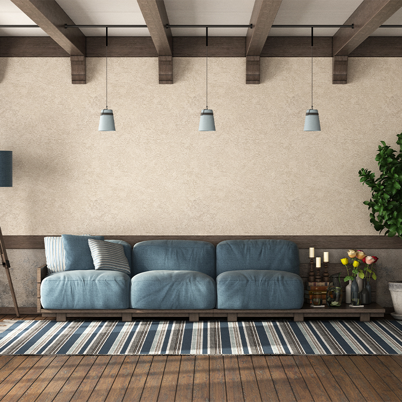
1. Blue: calm, relaxing, serene, tranquility

Softer shades of blue have a calming effect when used as the main color of the room.
Darker shades can be used on accent walls to slow down the body and mind. It allows the body & mind to recuperate.
It can make you feel calm, focused and content wherever you use it. So blue is recommended mostly for bedroom, bathroom, study rooms, kid’s room & meditation room.
Refrain from using dark blue in your main color scheme (entire room) as too much of dark color has a evoking feelings of sadness.
2. Yellow: joy, happiness, energy, attention
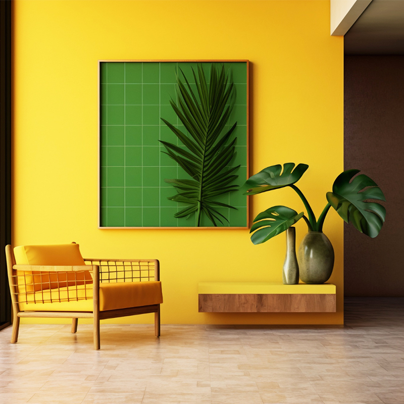
Do you want to cheer up and uplift your mood? Then yellow is the best option.
Softer and more pastel yellow colors can be applied to the entire bedroom and bathroom to create soothing and relaxing mood.
Darker shades are recommended for an accent wall in living rooms for a warm & friendly look.
Yellow can be used in dark rooms where there is no direct sunlight e.g. passages, kids activity zone, kitchen & gymnasiums.
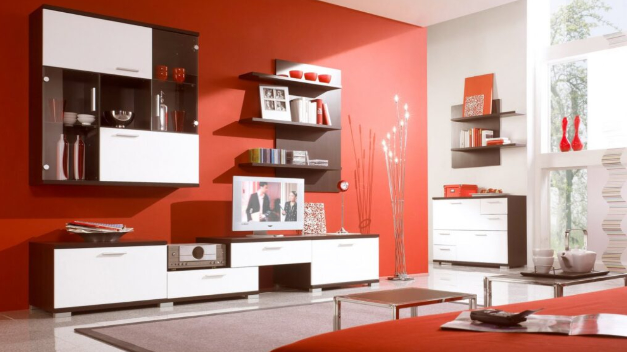
3. Red: energy, excitement, aggression, love

Red stimulates energy, creativity, conversation and creates excitement.
A fashion designer Valentino once suggested, red needs to be used like gold for furnishing a house.
At home, red can be used as an accent wall which is good enough to create the energy in the morning. It can be used in the living room & activity room.
It stimulates energy so can be used in social places like clubs, bars, dance rooms & so on.
Do remember: Too much red in the room will drain the body’s energy. So red should be used sparingly.
4. Green: restful, cheerful, calm, soothing
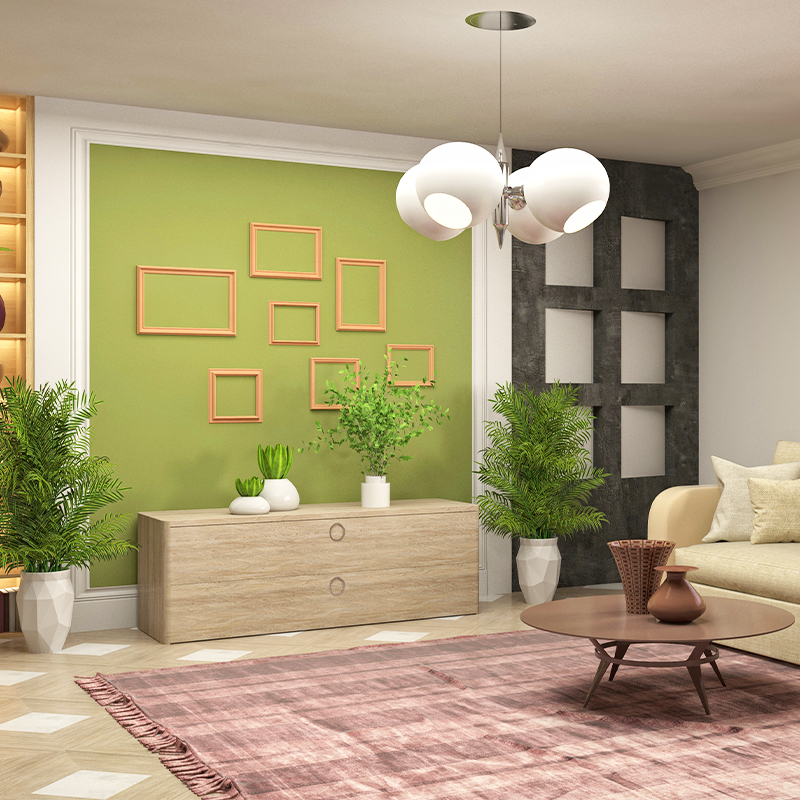
Green is a combination of blue and yellow. It has a refreshing quality of blue and cheerfulness of yellow.
Green works best if you want to relieve stress and create a calming effect and want to concentrate for a longer period of time.
It can be used in bed room, study room, meditation room, office & library.
5. Orange: happiness, energy, stimulation, prosperity
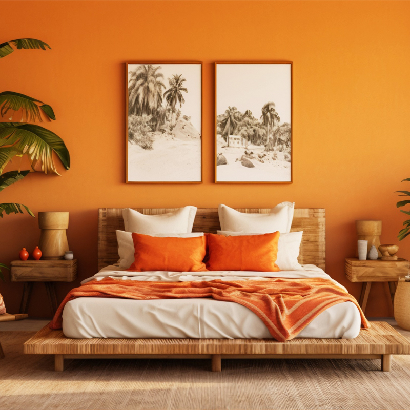
Orange is a combination of red & yellow. It stimulates appetite (you can see most fast food counters painted in orange).
It symbolizes livelihood, warmth & energy (like Sun). It helps in fun filled interactions & communication. If you want to have action, activity and high-energy then go for orange color.
It can be used in rooms such as the family lounge, living room, kitchen, dining room and kid’s activity room. It helps to open up & enhance the communication.
It can also be used in social gathering places such as party halls & lounges.
Do remember: Too much dark orange is overpowering & exhaustive. So use it sparingly.
6. Purple: luxury, royalty, mystery, peaceful

Purple is a combination of red and blue.
Similar to blue, lighter shades of purple like lilac and lavender have a calm, soothing and peaceful feeling.
Alike red, darker shades like amethyst, orchid, wine will become aggressive if used in the entire room. But can be used as an accent wall to create energy & creativity. It gives the feeling of royalty.
Purple is good to use in study room, kid’s room, bed room & living room
7. Neutrals: calm, relaxed, focused, elegance
Neutral color includes black, white, brown, grey & beige.
Great advantage with neutral colors is that they don’t have much effect on moods. We can add furnishings, accessories & art pieces to create a particular type of mood.
White, off white, light grey to light medium beige shaded are great for people who enjoy the feeling of clean, bright and open space.
White color creates the feeling of elegance & larger space so can be used for small rooms.
You can use black or brown color as an accent wall to give the stylish look to the room. When used sparingly black & brown gives the feeling of richness, confidence and being in control.
Summary:
Light colors are expansive and airy in nature and give the feeling of a larger and brighter look.
Dark colors on the other hand are sophisticated and warm; they give a feeling of coziness.
Tip:
By using green and blue color and taking help of neutral colors such as light grey or white you can make a small space look bigger. Blue and green creates a harmonious natural feeling as both are available in nature.
Along with these guidelines you need to choose color depending on your lifestyle & the function of the space.
To get in depth knowledge about color, paint and varnish click the link
Colors play an important role in Vastu as well.
Colors are associated differently with different rooms & directions.
Coloring a Living room is different from that of master bed room or kitchen.
Further, for kids bedroom, one needs to select different color than master bed room.
To know more about color and 7 layers of decoration click here